UX Research & Rationale
In the initial research for this project a round of stake-holder interviews was conducted to gather data as to what features users would potentially want in a movie recommendation app. the data from these initial interviews was then used to outline the app’s features:
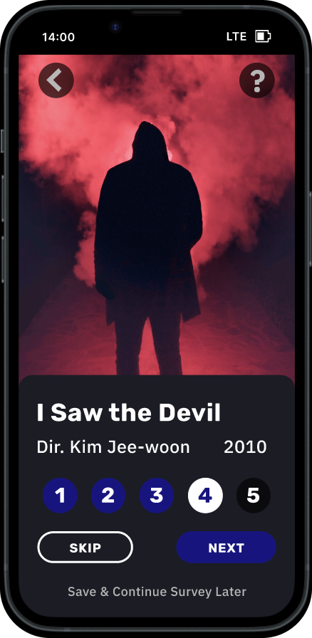
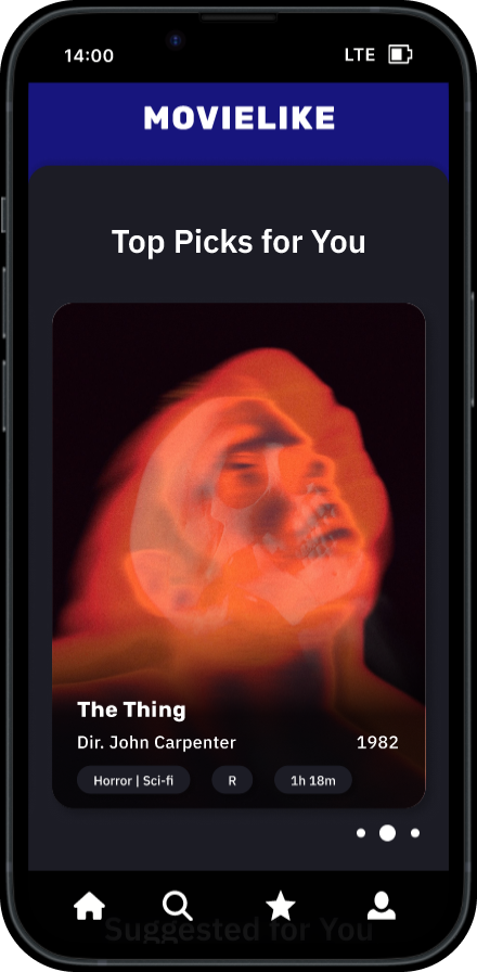
- Personalized film recommendations based on information gathered from the user during an on-boarding survey and refined through the user’s film ratings.
- Feature to organize watch lists and make film collections.
- A film finder that tells users which streaming or rental services their recommendations are available to view on.
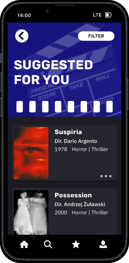
- A filter feature that allows users to filter their recommendation list by streaming or rental service so that they can easily find films available on the services they subscribe to.
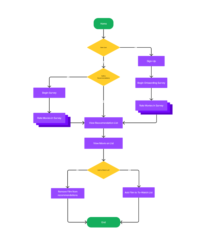
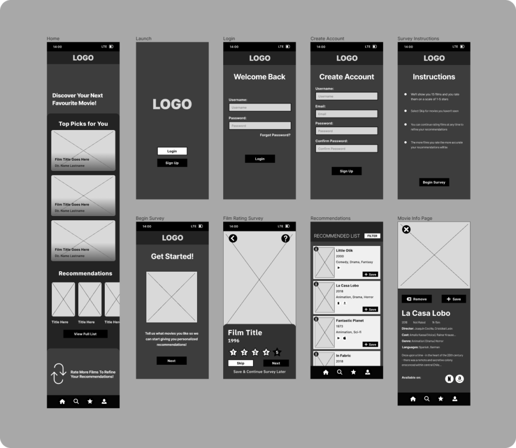
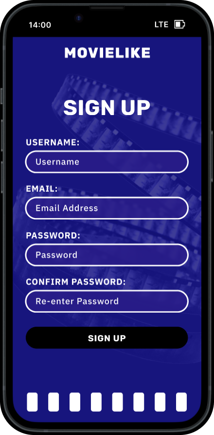
A task flow was then designed to outline the process of creating an account, completing the on boarding film rating survey, viewing the recommendation list, and adding a film to the to-watch list. A set of low-fidelity wire frames were when made to determine the screens and content needed to complete this task.
